
Edit: I used to be a huge supporter of eBird, both in terms of promoting it and through financial support of Cornell. This is no longer the case. I think eBird has had bad effects on birding, as detailed here. The Cornell Lab of Ornithology has also thrown their support behind this misguided decisions of the AOS to rename birds for nakedly political reasons, as covered here and here.
The previous post showed a simple cartogram of the US using the eBird species counts by state in order reshape the map. The relative sizes of the states in the cartogram are proportional to the species diversity.
A more detailed version can be obtained by using the species counts at the county level. Data as of early December 2017 was collected from eBird to generate the cartogram shown in Figure 1. The color scheme is based on the number of lists submitted by county, with blue representing more and red less.

It is an interesting image because it would seem to indicate that greater species diversity in the central US as opposed to the Pacific and Rocky Mountain states. But that really isn’t the case. The counties in the west are typically much larger than those in the central and eastern US. And those large counties do not have, on average, proportionately more bird species. So we end up with a map for which it is difficult to see much of any difference in the new sizes of the counties.
The color scheme shows a broad swath of reddish tones from Montana to the southwest and into Louisiana, then up into Appalachia. Judging from relative county size, this means there are a lot of under-birded but potentially very rewarding counties out there to be explored.
What does not jump out here is the fact that the nine counties with the highest species totals are in California. You’d think the opposite, given how the state has shrunken so much. Again, it is because those counties are so big to start with. And so, we see an example of how a cartogtram can seem to undercut its own purpose.
In this specific case, the problem is exacerbated by the fact that the overall distribution of birds by county does not span much range. The histograms for the species counts (left) and total number of lists submitted (right) are shown in Figure 2.
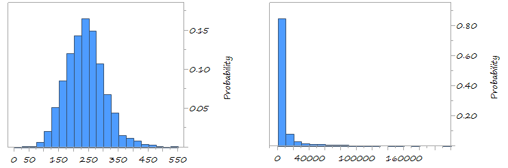
The distribution of species counts is not very wide; 805 of the data lies between 157 and 318, and the maximum value is scarcely more than the mean. The number of lists submitted is quite different; the 90th percentile is 15550. Only a very few counties get significantly larger numbers.
Maybe we should make our cartogram the other way around? Let’s let the total number of species reported by county be reflected by the color, and warp the map based on the total number of lists submitted. Here it is, in Figure 3:

Not surprisingly, highly populated areas and coastline counties are swelled up. Does it help to illustrate the differences in eBird data? Hard to say. Multivariate data is always a challenge to present.