
Edit: I used to be a huge supporter of eBird, both in terms of promoting it and through financial support of Cornell. This is no longer the case. I think eBird has had bad effects on birding, as detailed here. The Cornell Lab of Ornithology has also thrown their support behind this misguided decisions of the AOS to rename birds for nakedly political reasons, as covered here and here.
Cartograms provide a pleasing way to present geographical data. The idea is to redraw a map so that the relative sizes of its units (e.g. countries, states, counties, etc.) correspond to some measured quantity. A common example is a cartogram of population by country, in which the relative sizes of China and India become exaggerated, while large countries such as Russia and Canada shrink due to their small populations.
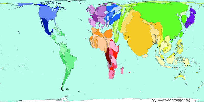
Instead of human population, let’s consider global bird species distribution by country. The raw data needed to construct this image was pulled from eBird. The figure below shows the result, where several regions, such as the UK and Belgium, were broken into component states. While the size of the country represents the number of species reported, the color scheme is based on the number of eBird lists submitted, with lighter colors corresponding to fewer lists.

The results are not surprising, but the map is striking nonetheless: Russia and Canada are barely perceptible, their landmasses reduced by a relative paucity of species; Central America bulges out and dwarfs the continental US; Australia shrinks in relation to the Indonesian island region; Northern Africa becomes compressed while the sub-Saharan countries bulk up; and northern South America shows its true dominance: little Ecuador is now practically as large as Brazil.
The color scheme illustrates how the majority of our worldwide birding efforts remain mostly in regions with less species diversity. It can also be viewed as an indicator of the infrastructure for birding that a given nation has, in some cases. Ghana, for example, has an adjusted size comparable to other West African countries, but its new size and color together show that it has developed into the most attractive destination in the region for global birders.
Making Cartograms
Constructing a cartogram requires an algorithm that will morph an existing map in such a way that the relative areas reflect the data. But a good cartogram must also produce an image where borders remain intact, and the component regions must retain enough of their original shape so that they are recognizable.
The process of making cartograms is not too difficult, but it isn’t simple either. There does not exist a single program that allows one to merely enter data, push a button, and have an image. Instead, several steps using different packages and data sources are required. The work here started with a query of eBird by-country data as of early December 2017, and the initial maps were downloaded from the Natural Earth site. The QGIS package was used to join the eBird data in with the map shapefile. The plots for global data were produced using ScapeToad to perform the morphing, using the highest quality (longest-running) setting. Finally QGIS was used to edit the ScapeToad output and produce the shading in the final cartogram.
Additional novel cartograms related to birding are in the works.